Responsive Design
What is Responsive Design and how can it improve your website?

What is Responsive Design?
More and more people are accessing the internet via their mobile phones rather than a desktop computer. Therefore it is important that your website is equally accessible on all devices, thats where responsive design comes in!
Background
The first mobile internet was introduce on Nokia phones in Finland way back in 1996. You may remember WAP which gained limited popularity in the early 2000s and allowed access to predominantly text based web pages, often at extortionate prices. WAP quickly started to die off in the late 2000s as phones began to offer full access to the internet in the same way you could access it from a computer.
Since then the use of mobile devices to access the internet has grown dramatically, back in 2014 more people in the UK accessed the internet from their phone than from a desktop for the first time.
As the use of mobile internet took off many websites created dedicated mobile websites, these typically were spearate from the desktop stites and often had their own web address. These mobile sites had reduced page sizes with less images and different layouts from the main website, this helped to make them easier to load and navigate on a phone. However this was not an option followed by many smaller businesses as it effectively doubled the upkeep of having a web presence by having to run two different sites simultaneously.
Fortunately this is no longer necessary, many modern phones have the processing power not dissimilar to a low end laptop and the distinction between phone, tablet and computer are becoming less distinct. This increase in the capcity of phones has allowed for the development of responsive design.
Need help with any of the terminology in these articles? Check out the Website Terminology page for definitions of many key terms.
Why does this matter?
A 2019 survey showed that over 70% of people in the UK use their mobile phone to access the internet in some way. If you currently own a website then this is an important trend, most older sites were not built with mobile access in mind, but what is worse is that several of the popular modern website builders do not come with mobile friendly designs as standard.
This has two main issues, firstly sites not designed for mobile devices either do not function correctly or they look messy and confused on a mobile device. The second problem is it typically means sending larger files to a mobile device which leads to slow load times, poor customer experience and is worse for the environment.
So what does Responsive Design do?
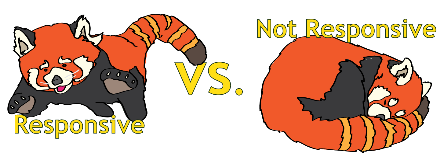
It is no longer necessary to have a separate mobile website in order to reach people browsing the internet on a phone. Responsive design is a key part of any modern website, at the most basic level the code of the website determines what size of screen is being used to view the website and adjusts the content accordingly to make it fit. The real advantage is that you only have one website, with one set of code and one lot of content.
A good responsive design will also optimise the content for the viewer, this means that it will adjust the size and position of images and text on a page in order to make it easier to read on different devices. In addition it will limit the size of the files appropriately, sending smaller images to devices with smaller screens so that the pages will load faster and be more enviromentally friendly. Not only that, but because most phones are connecting through a mobile network it saves your customers money on data as well as giving them a better experience!
Show me!
Want to see responsive design in action? Use the viewer to see what a site looks like on a desktop, tablet and mobile phone (Works for desktop users only).
Why does it matter?
A website that is unreadable or looks messy is worse than not having a website at all. You wouldn’t run a shop or restaurant with broken windows and doors hanging off the hinges, so why would you allow your online shop front to look tatty?
Speed is also essential. Most users will give up on a site if it doesn’t function within 6 seconds and half will give up in just 3 seconds. Despite this the average webpage currently takes 7 seconds to fully load, not only that but average load times are actually getting slower.
The small a web page the more enviornmentally friendly it will be, smaller webpages require less electricity to transmit to a user device, less energy for the device to load and display the page and take up less space on the web server, all of which can help lower the carbon footprint of the site.
How can No Lesser Panda help?
So here is the pitch, No Lesser Panda offers optimised responsive design as standard across all web design projects. That includes:
- A fully responsive design that looks great on desktops phones and tablets.
- Optimised images images for faster load times.
- Light but effective coding.
- A reduced carbon footprint.
- Guaranteed fast load times tested and proven with tools like PageSpeed.
Want to find out more? You can get in touch at [email protected]
This article is the first in the No Lesser Panda Explainer Series. The series aims to provide information about important web design topics to people from a non-technical background.
You are here: Home / Articles / Responsive Design
